The Anatomy and Purpose of an Endcap: 4 Brands That Have Turned This into an Art
Have you ever opened your closet to get dressed for work or an appointment and felt completely uninspired by seeing the same clothes you’ve worn time and time again? Did you ever wonder if perhaps your in-store signage and displays might be having the same effect on your customers?
While sturdy, dependable fixtures and templated signage are without a doubt great (and necessary) long-term investments, when left unto themselves, excitement and interest they do not generate. It’s easy to fall prey to the number one killer of good marketing—boredom—because we get it, you’ve got a lot on your plate.
However, today’s shopper, they’ve come to expect, wait…no…they demand change, inspiration and information just as rapidly and diversely as they get with a few swipes on their phones or clicks on their laptops. Boring, or more importantly unchanging, visual stimuli in-store is not only a game killer, but a brand changer as others with more to offer in terms of an in-store experience become the preferred shopping destination.
Your displays and in-store signage serve as your “warm-up” crew before the show. They’re the ringmasters, ambassadors and stewards of your brand. Ignoring these or letting them become stagnant and mundane will inevitably eat away at your shopper’s curiosity. And curiosity, exploration, visual stimuli are some of the things that help drive traffic into your store and down the aisles, not to mention getting your shoppers to come back for more.
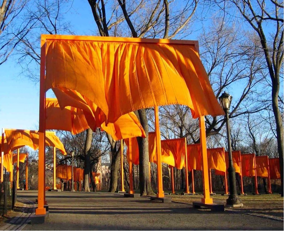
Large-scale creativity and innovation can breathe new life into any environment.
Take, for example, how a number of years ago the artistic team Christo and Jeanne Claude, who made a career in the art world by augmenting parts of our everyday landscape in deceptively simple ways, installed 7,503 saffron gates along 23 miles of walkways in Central Park. The brightly colored fabric curtains brought new focus and excitement to a New York City pedestrian infrastructure that rarely changes except for the seasons, and in doing so completely transformed the experience of being in that space and brought in another reason to be there.
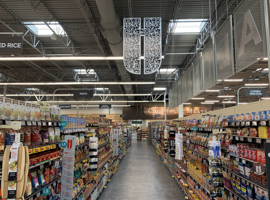
Or, most recently how Hy-Vee is re-imagining the routine grocery shopping venture as an experiential brand exploration by incorporating QR code into their signage and display and a consumer engagement strategy.
While these two examples might showcase large and somewhat over-the-top efforts towards transforming landscapes or brand promotions, they do present the case that different, unique and not run-of-the-mill approaches to keeping your audience engaged is something that should not be underestimated as a marketing strategy. And now thanks to social media and all of the visual influences there, your shoppers want their in-store experience to visually stimulate in the same way and at the same regularity.
Medallion Retail proposes that signage and display play a key and on-going role in keeping your shoppers alert, engaged and most importantly, buying from you. But keeping your in-store messaging fresh and brilliant doesn’t necessarily translate to major investments of budget or time.
What it does mean is looking at your in-store real estate and rethinking the approach, personality and consistency in delivering all that your shoppers might be looking for. You might think that what you have suffices, but it’s the effect it has on your shopper that’s the key. Does it get them to notice, stop, think and ultimately dwell? Do they interact, touch, explore readily? And where does the best opportunity to do these three very important things present itself?
While there are many places within your store to optimize shopper engagement, none are more important than your endcap display. No news here. But not all endcaps are equal in their ability to grab eyeballs. And it’s here where we will highlight some recent examples of how some brands are approaching this highly influential footprint within the store; what they did to grab consumers’ attention and how you might replicate for your brand.
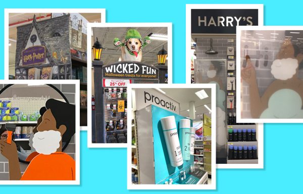
Ulta Endcap Attraction: Changing the Space with Dimensional Displays
Ulta is currently making a big splash at Target with 58 new concept stores, the first in a staged rollout of potentially 800 in total. According to Ulta CEO Dave Kimbell, shoppers are thrilled with the new stores-within-a-store. Kimbell said that “everything was designed to create an inspiring and unique beauty experience.”
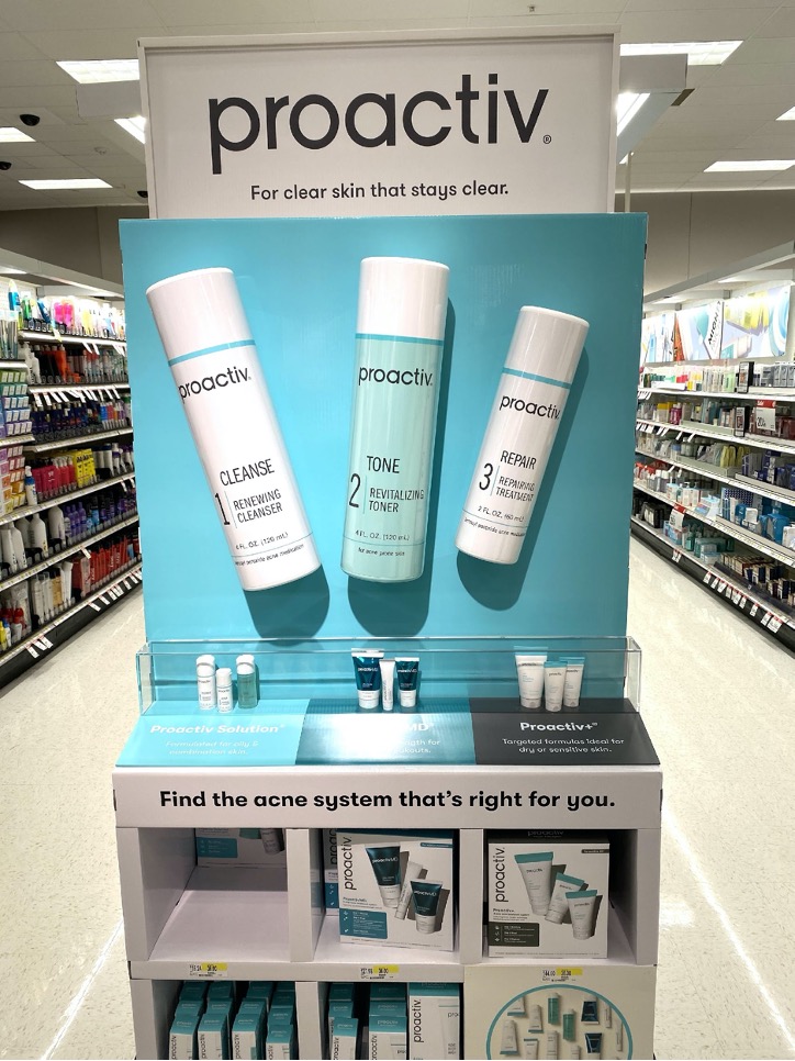
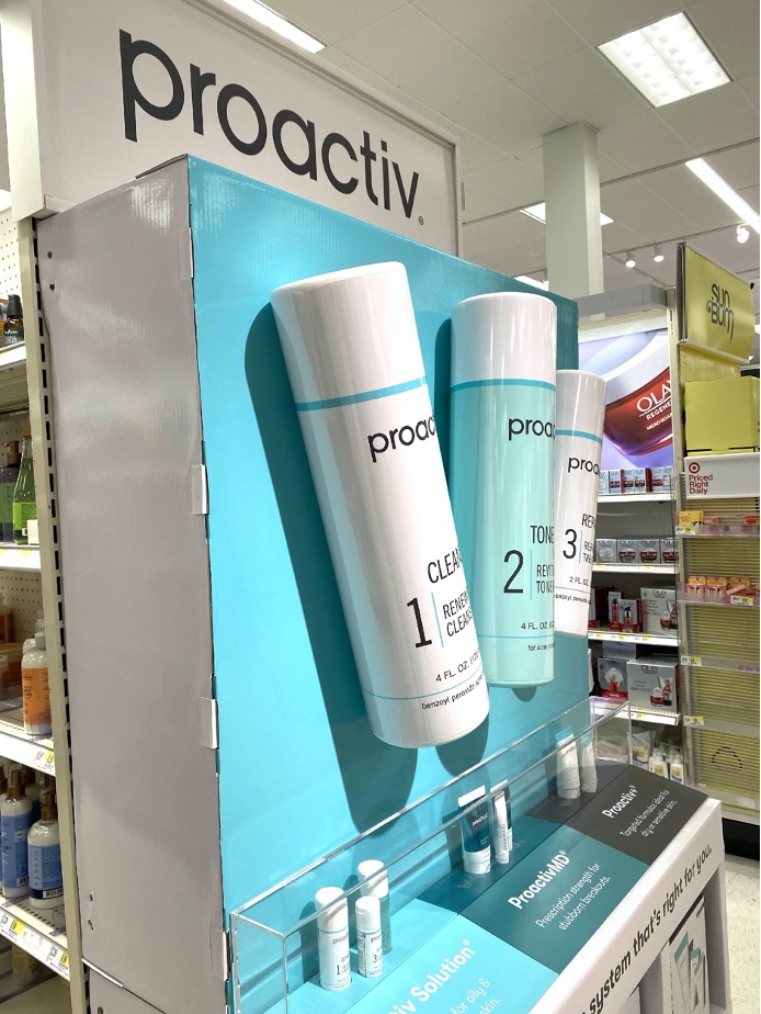
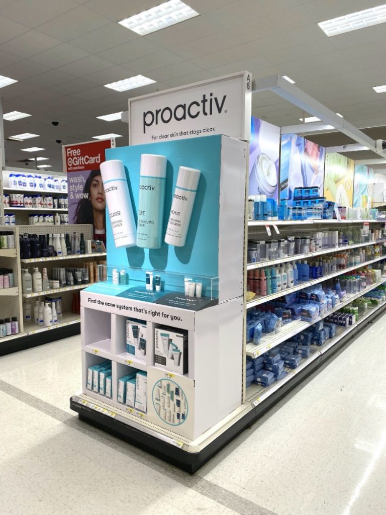
Of note in this new partnership concept shop is the endcap display for Proactiv. The endcap space has been transformed and made dynamic through a giant-sized rendition of the product and application of inexpensive cardboard countertop, all merged together to mimic a traditional display case. Product is stored in “cubbies” in the bottom cardboard base “cabinet”. The top of this same base “cabinet” creates a counter area which is dressed with an angled panel for messaging, and used to introduce and describe the three sublines of Proactiv product sold on the display. At the back of this product descriptor panel is a long plexiglass case that houses product samples representative of the three product lines. The use of the plexiglass case is an intentional introduction of a higher-end material more frequently seen in department store displays and increases the perception of product value on the part of the shopper.
By far the most striking feature of this display is the inclusion of three outsized Proactiv product bottles mounted above the display “counter”. The gigantic bottles, made from hard, glossy plastic, push out into space and away from the brilliant blue background they are mounted on. In strong store light, the bottles cast dramatic shadows onto the shiny blue background. This area of the display serves as an excellent beacon to draw the attention of shoppers from aisles away, and almost overpowers the Proactiv sign mounted directly above.
It’s ironic that a display made almost entirely from cardboard can so successfully communicate that higher-end skin care is now available at Target. “We want to make it really simple and joyful, really allowing the guest to trust that we have taken a lot of work out for them, so shopping is easy, accessible and fun,” said Cassandra Jones, vice president of beauty at Target.
Harry’s Endcap: Storytelling Sells
Harry’s Shave Club similarly made an auspicious debut at Target a few years ago. In the first four weeks of rollout of their program, Harry’s captured 50% of the razor sales at Target, and 10% of blade sales in the following weeks. We suspect their dedicated endcap may have had a lot to do with this, and we’re not alone.
The Harry’s endcap in Target must be the most warm and humorous use of endcap space that we have seen. The approach obviously worked well to create brand awareness and build sales.
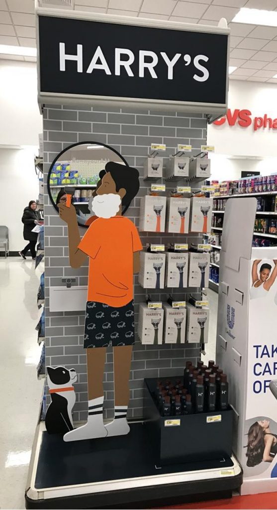
At the very top of the endcap, a large Harry’s logo appears in stark white on a black ground. Simple illustrations in the minimal, Harry’s branded color palette are printed, mounted and die cut from styrene, and are installed at varying distances from the back wall of the endcap to create the illusion of three-dimensional form in space.
The backwall of the endcap is covered with a printed illustration of grey bathroom subway tiles, with the right half of the space serving as a pegged display area for packaged Harry’s product. Bottles of shaving cream sit below the pegged product in an open container formed from cardboard. On the left half of the endcap there is an illustration of a man shaving in boxers and socks, in front of a sink and mirror as his dog looks on. His bright orange shirt is a large spot of strong color that draws the shopper’s eye to the center of the endcap. The mirror reflects the shopper’s own gaze, incorporating them into the scene.
Concept is king in this Harry’s endcap. We are observers of this man’s morning routine involving his dog and razor. And although this endcap space has been transformed into a “bathroom”, the space itself has been merely sketched for us using simple materials and techniques.
And Harry’s story continues…
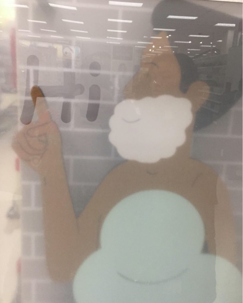
More recently, Harry’s and Target reupped themselves with a new version of the Harry’s endcap. Pushing the concept even further, we find that the shaving man is now naked, but discretely covered in layers of bubbles. He is inside what appears to be a shower stall and is tracing the word “Hi” on the fogged-up glass. A cardboard riser holds bottled product on the bottom right with pegged razors and blades hanging above.
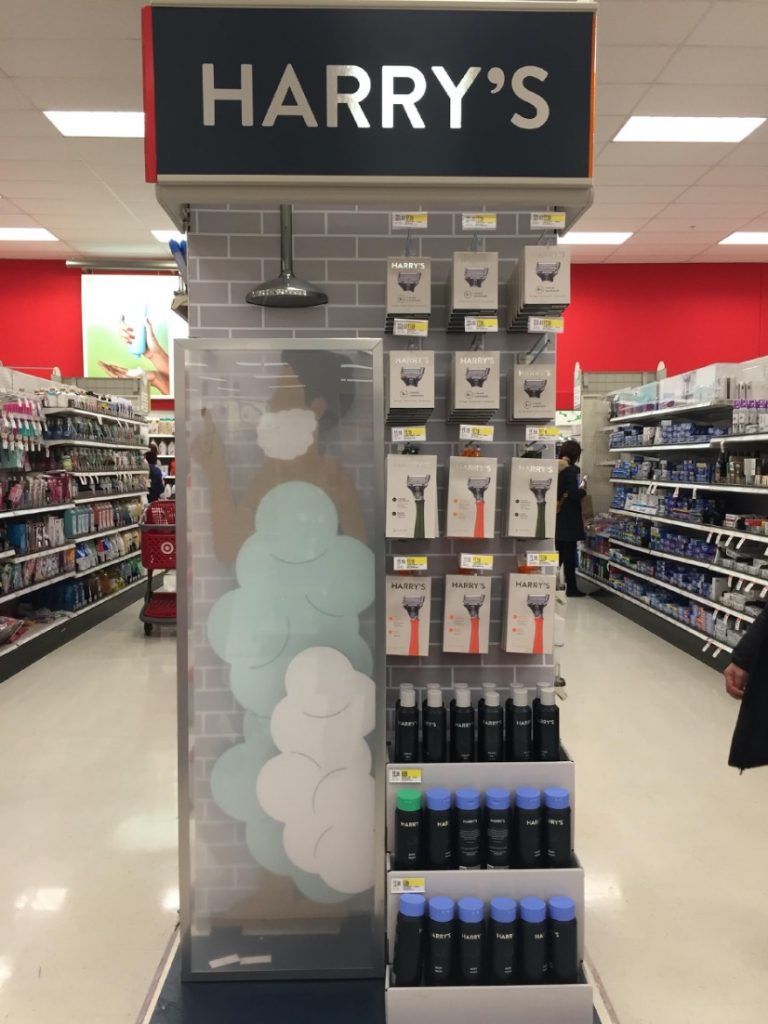
The shaving man and his bubbles are made from illustrations adhered to a thick foam board, all again spaced in varying degrees from the back wall of the endcap to create the illusion of depth.
While Target and Harry’s must have invested more into making the glass and metal shower stall (complete with showerhead) in this second iteration of the Harry’s endcap concept, both versions use primarily inexpensive materials to completely transform an existing store fixture—much to the delight of Target’s customers and Harry’s bottom line.

Barnes & Noble Fantasy: Creating a Concept Shop That Begins at an Endcap
Medallion Retail helped Barnes & Noble make a dramatic statement using existing three- and four-bay gondolas and endcaps in the front of their store. The initial client request was to create a big, bold, dedicated and immersive Trend Shop for Harry Potter and Star Wars merchandise that would be semipermanent.
Medallion delivered by creating two unique environments. A system of die cut panels of art were printed on cardboard and mounted back-to-back using foam spacers at the sides and top to create and “envelope”. Each metal gondola bay category sign holder was disguised by slipping an upside-down “envelope” of art over it, and in turn, the category sign held the “envelope” upright. An additional die cut piece was used to cover the gaps between each upside-down envelope, creating a flexible system with a contiguous, layered look that could be used for both three- and four-bay gondolas.
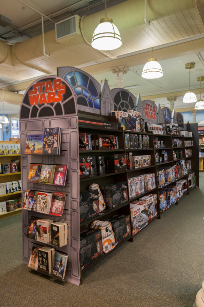
The endcaps of the gondola were dressed with large die cut pieces of coordinating art which were printed on cintra to provide durability. Slots were die cut into the cintra for the insertion of existing plexi shelving that pressed the panel against the wood slatwall endcap securely while displaying merchandise. On one side, the gondola was dressed in custom art that supported the Star Wars branding, creating an evergreen concept shop for a wide variety of Star Wars merchandise.
On the other side of the gondola, the Harry Potter publisher had permitted the beautiful and whimsical Harry Potter illustrations by Jim Kay to be used to create an immersive branded experience. The Tudor Quidditch supply shop illustration used as an endcap application was particularly transformative and was a Harry Potter fan favorite.
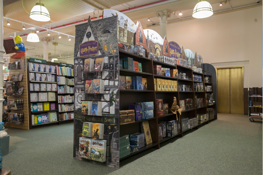
The Harry Potter and Star Wars concept shop displays were simple in concept and application, but multidimensional in appearance and effect. The bold use of scale, color and shape completely transformed the look of the display gondola at the front of the store, magnetically attracting customer attention. This program had an expected duration of 6 weeks, but record product sales caused it to remain in place for over 6 months. The program cost was only $307.00 per store per store and impressively shipped in two flat boxes.
Gondola Reimagined: Hogwarts Castle
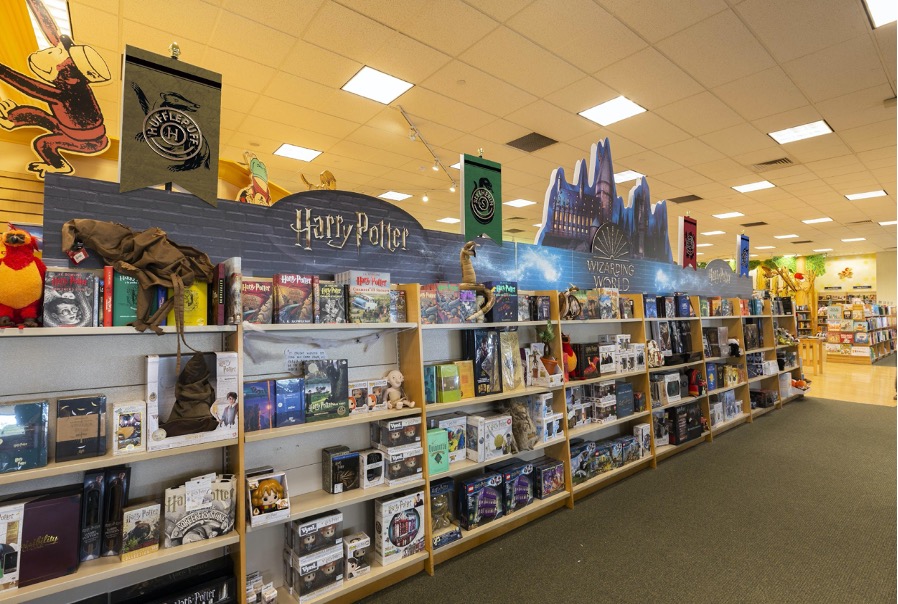
Because sales proved to be so strong, Barnes & Noble reintroduced the Harry Potter Concept Shop in a similar iteration utilizing different art. Following the Harry’s/Target lead, the program was expanded with a greater investment per store.
The second Concept Shop features a huge, die cut illustration of Hogwarts castle, positioned in the center of the bay, surrounded by brand logos. The highlight of this display is the jewel-toned, foil-stamped Quidditch Team logo flags that hang from three-dimensional flag poles. Coroplast, a lightweight but durable material, has been used for greater permanence and ease of installation.

PetSmart Endcap: Gateway to a Gondola Transformation:
Rounding out our discussion of creative ways to transform existing fixtures is an example from PetSmart. PetSmart creates excitement for Halloween (which must be the biggest pet holiday?) by releasing a new line of pet costumes every Halloween. Following in the footsteps (or paw steps) of the uber-creative Spirit Halloween pop-up shops, PetSmart has created a product line and campaign for Fall 2021 with the clever tagline, “Halloween Treats for Everyone!”. The front-of-store display features treats that range from dog bones specially packaged in small cardboard coffin-shaped boxes to mariachi costumes for guinea pigs.
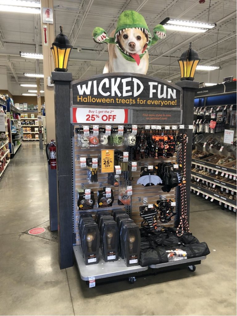
PetSmart has used die cut cardboard to wrap the entrance-facing side of their front of store gondolas, creating a tall, visually interesting display that breaks away from the typical pet store metal shelving and greets shoppers as they enter the store. The arched “Wicked Fun” header is topped with a die cut photo of a dog wearing an Audrey the Man-Eating Plant costume (from Little Shop of Horrors), putting one of PetSmart’s humorous new costumes for 2021 front and center in the display.
Three-dimensional wood-patterned lamp posts created from folded cardboard are adhered to either side of the gondola endcap, disguising the fixture by building out and over its footprint. The lamp posts are topped with illustrations of antique lanterns complete with finials on top, and are constructed from bisecting, die cut pieces of printed cardboard. The bright gold color used for the lanterns is an attention-grabbing spot of brightness.
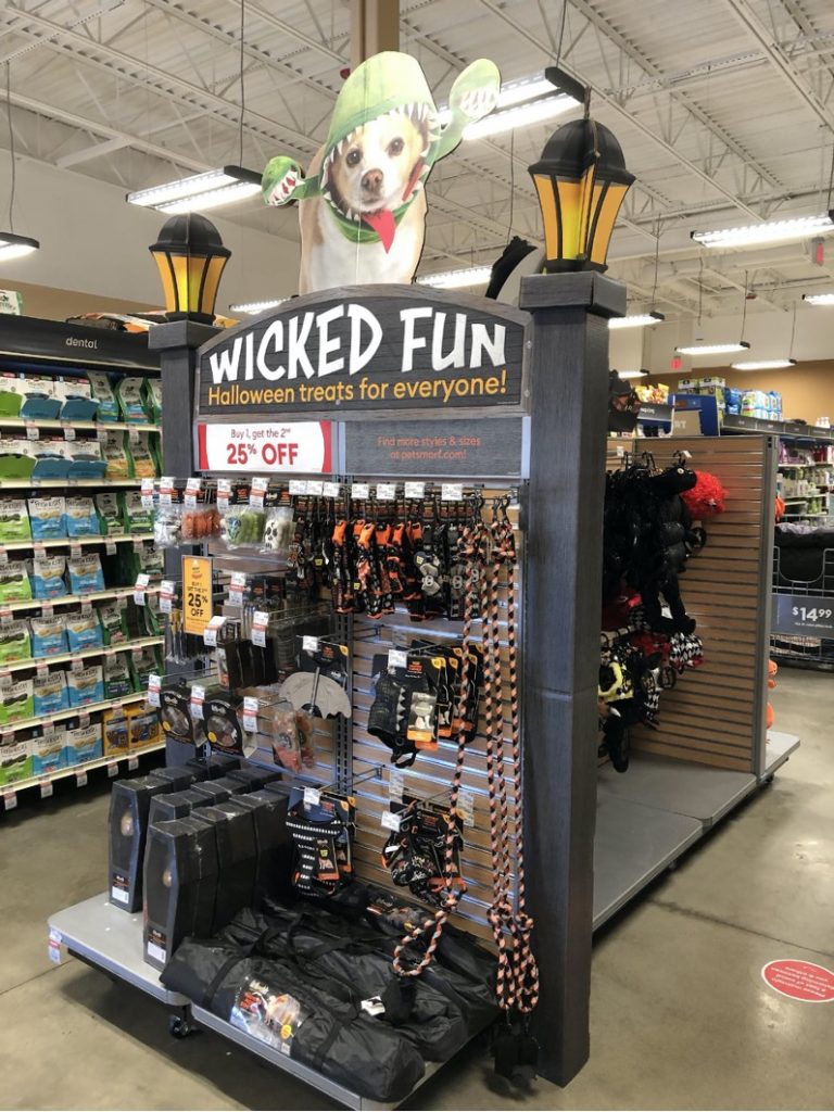
PetSmart has strategically invested in dressing only the front portion of this particular floor gondola, curtailing expenses without sacrificing the wow factor for those entering the store and seeing it for the first time. These displays are printed on cardboard and shipped flat to stores, requiring store personnel to fold and assemble each display.
Ideas and Execution: The Inseparable Creative Team
The pairing of concept and art, combined with affordable production materials, methods, and shipping is a winning formula that can help retailers inexpensively transform their existing store fixtures and create a sense of excitement for their customers. For over 60 years Medallion has earned our place in the industry by thinking differently to create innovative and unique ways to delight and engage on the sales floor.
As we stated in our July blog, “the in-store environment has never been more missed and more sought out by shoppers…” To learn about how we can help you turn your customers into a captivated audience, check us out at medallionretail.com or give Medallion Retail’s Chris Gordon a call at: @ 646.677.5618.