10 Mistakes to Avoid When Building a Point of Purchase Display
With over 60 years experience in retail signage and marketing, at Medallion Retail we have learned what works and what won’t. A well-designed point of purchase (POP) display can significantly boost sales and strengthen brand recognition. But a poorly executed display can confuse shoppers, reduce engagement, and waste your marketing budget. In our complete guide to retail displays, we outline some common pitfalls. Here we expand upon the missteps marketers make and offer 10 critical mistakes to avoid when creating POP displays:
- Ignoring Your Target Audience
- Overcrowding the Display
- Poor Placement in Store
- Neglecting Brand Consistency
- Using Low-Quality Materials
- Failing to Communicate Value Quickly
- Poor Lighting and Visibility
- Ignoring Shopper Interaction
- Not Testing Before Launch
- Overlooking ROI
1. Ignoring Your Target Audience
Your display should appeal directly to the shoppers most likely to buy your product. Ignoring customer characteristics, preferences, or shopping habits can render even the most visually striking display ineffective. When developing your display, keep in mind these key elements of a target audience:
- Demographics: Age, gender, ethnicity, income, education, family status, occupation.
- Geographics: Location (city, region, climate).
- Psychographics: Beliefs, values, attitudes, hobbies, interests, lifestyle, buying habits.
- Behavioral: Purchase history, brand loyalty, usage rate
By tailoring your message to the audience you are trying to reach, you increase your display’s efficacy and avoid wasting marketing dollars.
Solution: Rely on market research when designing your display. Customize your message for the customer you want to attract.
2. Overcrowding the Display
One of the most common mistakes retailers make when designing point-of-purchase displays is overcrowding. Avoiding overcrowding is good marketing and good design. Too much information or too many products can overwhelm shoppers and dilute your key message. When shoppers encounter too much information, they might ignore your display all together. For a more effective approach, keep the display simple and focused. Highlight just a few key items that naturally draw attention. A cleaner, more streamlined presentation helps customers make faster decisions and increases the likelihood of impulse purchases.
Solution: Keep it simple—highlight one product or offer per display and maintain a clear messaging hierarchy.
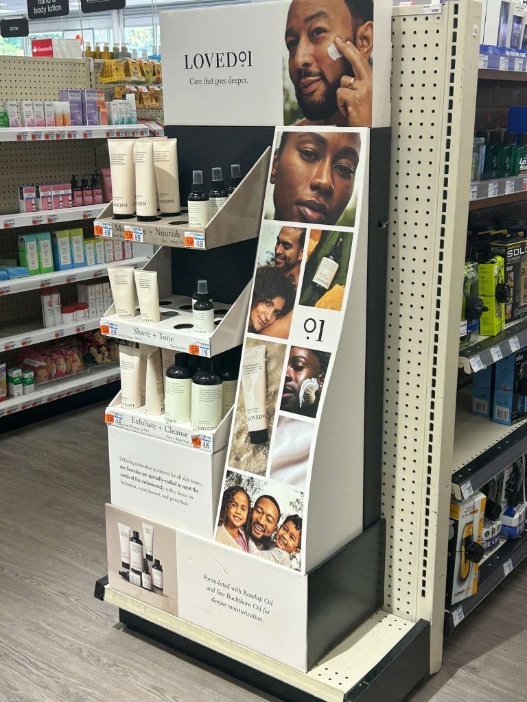
3. Poor Placement in Store
Even the best design fails if it’s in a low-traffic area or hidden from view. Placement can make or break a display. High traffic areas include:
- Store Entrance/Decompression Zone: The first area customers see, perfect for big announcements and initial engagement.
- Power Wall: Since most North American shoppers turn right upon entering a retail location, the front right wall of a store offers the first opportunity to grab their attention.
- Checkout/Point-of-Sale (POS): Where shoppers wait, ideal for impulse buys and loyalty program sign-ups.
- Main Aisles/Pathways: The primary routes customers take through the store; great for guiding traffic and featuring key promotions.
- Endcaps: End of aisles and promotional displays draw attention and encourage exploration.
- Department Transitions: Areas where one section ends and another begins (e.g., electronics to home goods).
Solution: Use strategic placement of your display to maximize impact and increase ROI.
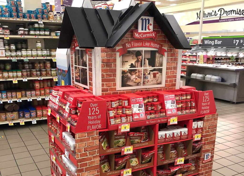
4. Neglecting Brand Consistency
A POP display should reinforce your brand identity. Using off-brand colors, fonts, or messaging can confuse shoppers and weaken recognition. According to marketing executive Jessica Wong in her article in Forbes, brand consistency is key to
- Building brand recognition: “Repeated and consistent exposure to these branding elements builds the brand’s values and reinforces its identity in consumers’ minds,” notes Wong.
- Establishing trust and credibility: Consistency conveys professionalism and reduces confusion, increasing the likelihood a shopper will choose your product.
- Enhancing customer loyalty: By fostering an emotional connection with your brand, consistency builds on existing goodwill and encourages conversion.
She recommends focusing on these key elements of brand identity:
- Visual identity: Your color pallette, typography, brand guidelines and more reinforce coherence across channels.
- Messaging and tone: Make sure the copy on your display sounds like the rest of your campaigns and
- Customer experience: Especially relevant on interactive displays, a seamless experience with your product in-store will enhance your customers’ relationship with your brand.
Solution: Make sure your display adheres to brand guidelines and reinforces your unique identity.
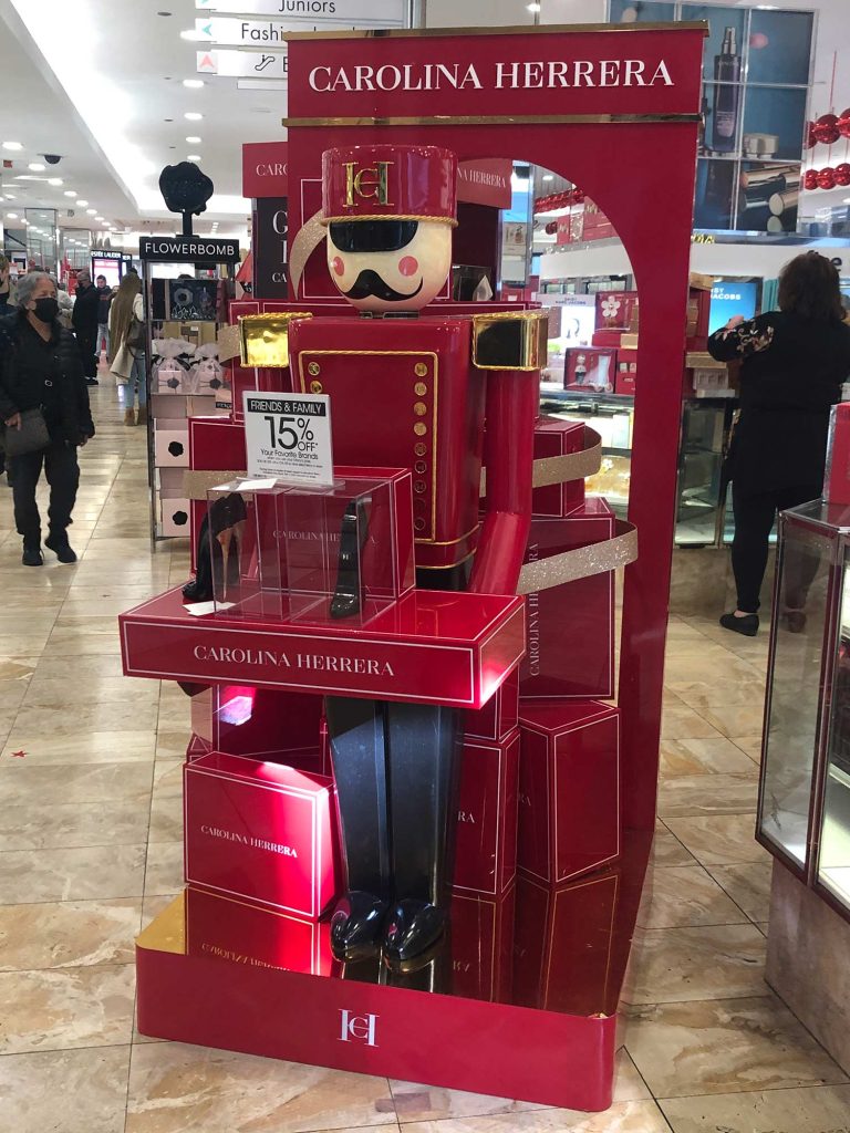
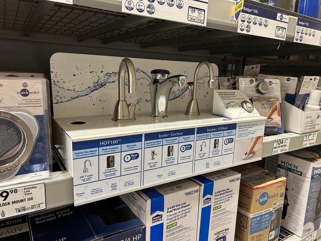
5. Using Low-Quality Materials
Flimsy or cheap materials reduce perceived value and may not survive the retail environment. But a temporary display constructed with expensive components wastes money and reduces ROI. At Medallion we use value engineering to balance cost and quality, ensuring your displays stand up to real-life use while staying on budget. Common display materials to consider include:
- Cardboard/Corrugate: Great for temporary or test displays due to low cost and easy repositioning; excellent for seasonal promotions.
- Acrylic/Plastic: Versatile, clear, durable, and sleek; used for risers, holders, and interactive displays; offers good visibility and customizable finishes.
- Wood: Provides warmth, elegance, and a natural feel, suitable for rustic or high-end themes; can be heavy and costly but durable.
- Metal/Wire: Offers strength for heavy products, a modern or industrial look, and is ideal for sturdy fixtures like racks and gondolas.
- Fabric: Lightweight, great for banners, tension displays, and backlighting to create dramatic, customizable visuals for apparel and textiles.
- Foam Board (Gatorfoam/PVC): Lightweight, color-rich, and used for lightweight display boards, often with protective plastic overlays.
Solution: Collaborate with an experienced marketing partner like Medallion Retail with expertise in the materials available and their cost, drawbacks and benefits.
6. Failing to Communicate Value Quickly
Shoppers decide in seconds whether to engage. If your key benefit or offer isn’t instantly clear, you lose potential buyers. Your Unique Selling Proposition (USP) sets you apart from the competition and you should be able to communicate it effectively in a minimum of space.
Distilling your product’s key differentiators into a clear, concise message can be challenging—but it’s one of the most valuable steps in the process. This exercise forces you to sharpen your focus and identify what truly matters to your customer: their needs, pain points, and buying motivations. When space is limited and you can’t communicate every feature, narrowing your message to two or three meaningful points helps ensure your display stays clear, compelling, and effective.
Use specific, benefit-driven language rather than generic claims. Instead of saying “high quality,” highlight what makes your product stand out — such as “made with 100% organic ingredients” or “lasts twice as long as standard brands.”
Solution: Concisely convey your USP to let shoppers know what makes you different.
7. Poor Lighting and Visibility
Displays that are hard to see or poorly lit fail to attract attention.
As we note in our article, “The Five Unbreakable Rules of In-store Signage,” lighting is too often an afterthought in retail design, leading to signage that’s not lit properly and fails to draw attention. In general, the lighting for in-store signage and displays should be twice or even three times the store’s level of ambient light. Effective lighting techniques for POP displays could include the following:
- Layer Lighting: Combine general ambient lighting with accent lights (spotlights, LED strips) for depth, and task lighting at service areas.
- Use Contrast: Create visual interest by making featured displays brighter than surroundings (e.g., 3:1 or up to 30:1 contrast) to attract attention.
- Highlight Verticals: Light vertical walls and shelves to make spaces feel airy and guide customers, using hidden LEDs for seamless glow.
- Focus on Details: Use narrow-beam spotlights or under-shelf lighting to make high-value items (jewelry, metallics) shimmer and stand out.
Solution: Use lighting, bold colors, or reflective surfaces to make your POP display stand out.
8. Ignoring Shopper Interaction
Interactive elements like demos or QR codes can boost engagement — but if they’re confusing or inaccessible, they backfire. Interactive displays can influence shopper behavior through:
- Attention & Curiosity: Eye-catching displays disrupt routine and draw shoppers in.
- Emotion & Desire: Displays evoke feelings (excitement, desire) that influence decisions.
- Education & Discovery: Grouping complementary items or providing quick info (via QR codes) helps shoppers explore and find new products.
- Impulse Purchases: Appealing displays trigger unplanned buys, with stats showing 62% of shoppers making impulse buys from good displays.
- Brand Experience: An organized, appealing display reflects well on the brand, building trust and making shopping easier.
Solution: Employ interactive elements that make sense for your marketing objectives, not just for the sake of novelty or trends.
9. Not Testing Before Launch
Concepts that look great in the studio may fail in real stores. Prototypes provide an opportunity to test your design and adjust accordingly. Medallion’s process of value engineering includes prototyping for every display. That way we can ensure the materials, design and messaging achieve the right goals for the least amount of money.
Before launching a full-scale retail display, building a prototype can save significant time, money, and frustration. A prototype allows you to visualize the design in three dimensions, test how shoppers interact with it, and refine elements like branding, messaging, and functionality. It also helps identify practical issues—such as assembly challenges or durability concerns — early in the process. By prototyping first, your team can collaborate more effectively and ensure the final display not only looks polished but also drives engagement and sales.
Solution: Before committing to full production, place the prototype in a real or simulated retail environment. Observe shopper behavior and adjust the display to improve sales performance.
10. Overlooking ROI
A beautiful display that doesn’t drive sales wastes budget and effort. Measuring success ensures strategic marketing spend and incremental improvement with each iteration of your display. Track these key performance indicators (KPIs) to keep tabs on how your marketing is performing and how it can improve:
- Revenue/Sales Uplift: Direct sales tied to campaigns.
- Customer Acquisition Cost (CAC): Cost to get a new customer.
- Conversion Rate: Percentage of actions (purchases, sign-ups) completed.
- Customer Lifetime Value (CLTV): Total value a customer brings over time.
- Engagement: Time spent, QR scans, comments.
Solution: Track KPIs over time and refine displays based on performance data.
Successful POP displays combine visual appeal, clear messaging, brand consistency, and shopper convenience. Avoid these common mistakes to maximize your display’s effectiveness and boost in-store sales.
Learn more about designing effective POP displays that increase shopper engagement and ROI.