At Barnes & Noble, a Story of Fantastical Retail Transformation

You’re a wizard, Harry. May the force be with you.
For readers young and old, there are perhaps no two literary franchises more ubiquitous than Harry Potter and Star Wars. To date, the Harry Potter brand has generated nearly $8 billion in book sales, while Star Wars books have brought in $1.8 billion—to say nothing of revenue from associated merchandise, video games, and of course, the box office.
When brand recognition reaches such a high level, marketing may seem simple—but this is only an illusion.
Shoppers don’t just want to buy the latest edition. They want to enter the wizarding world or fight alongside the rebel alliance. But how is it possible to execute this retail theater in-store, without a magic wand (and without imposing on other in-store product displays)? The answer is retail transformation.
The benefits of a trusted team
Barnes & Noble faced this question last year. The Fortune 1000 bookseller wanted to create a permanent in-store destination, or “trend shop,” for all Harry Potter and Star Wars merchandise. To accomplish this, they needed an original, creative display that could capture attention, compelling shoppers to explore and discover new products. For help, they turned to their longtime marketing partner, Medallion Retail.
“We have a working relationship with Barnes & Noble that goes back 25 years. We know their stores and brand intimately, which helps us execute creative signage expertly,” said Therese Daves, President and Owner of Medallion Retail.
But there was one catch: Barnes & Nobles wanted to focus on the brands’ literary elements, not the cinematic ones. This means no stills from iconic movie scenes or pictures of the cast to lean on.
Taking design clues from the target audience
“From the start, we knew that this display couldn’t have a commercial, Hollywood feel to it,” said Nick Carozza, Director of Account Management at Medallion Retail. “But we didn’t see this as a roadblock. Instead, it was an opportunity to excel creatively. We were eager to create a one-of-a-kind brand moment that would resonate with the Barnes & Noble brand, and still surprise and delight even the most fervent Harry Potter and Star Wars fans.”
Medallion Retail’s team knew the display would also need to harmonize with the existing store environment. Barnes & Noble has a particular, unique in-store look and feel—so the “trend shop” had to fit in, even as it stood out.
“Barnes & Noble is a standard-bearer in the literary world. Whenever we work with them, we keep this in mind—the display would need to feel authentic and engaging, without becoming cheesy or kitsch,” said Daves.
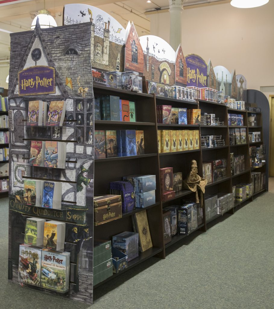
These parameters gave the Medallion Retail team an idea. Instead of pushing in-store furniture and fixture aside, why not leverage existing elements to transform the space? Barnes & Noble’s bookshelves, called bays, would take center stage. Using corrugate, the Medallion Retail team created tall endcap signage to wrap around and transform the bay. These endcaps were far more intricate than normal signage—in fact, they served as a kind of portal into another world. Using bay toppers, the theme wrapped around the fixture, continuing on top of the shelving to create a truly elevated experience.
A transformative retail experience
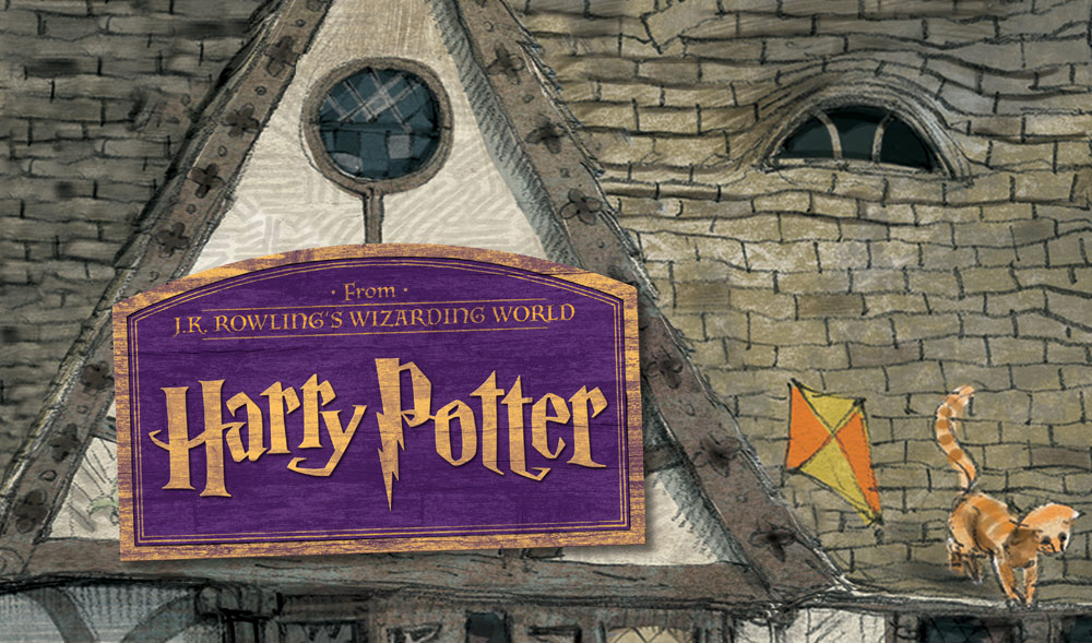
Consider the Harry Potter display. For this, the Medallion Retail team took inspiration from the imagery of Diagon Alley, the cobblestoned shopping center of J.K. Rowling’s Wizarding World. The endcaps resemble the storefront of a wand shop or owl store, rising up to display an illustrated dormer window and the iconic Harry Potter font. Spanning the top of the bays are corrugate toppers, illustrated to depict the angled roofs and brick chimneys of the book’s setting. The aisle transports shoppers into Harry’s world—no broomstick required.

“This had to look and feel very authentic. The target audience, die hard Harry Potter fans, would notice if the displays were missing details from the books. So we did our research to make sure the final product resonated,” said Therese Daves, President of Medallion Retail.
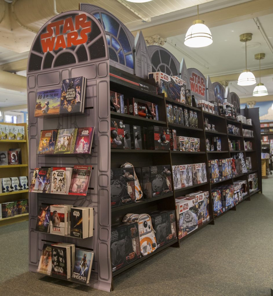
The Medallion Retail team took a similar tactic with the Star Wars display. Only this time, they had to get a bit creative and produce original illustrations to bring the literary fantasy world to life.Remember: B&N is about books, movie stills would not be in keeping with the literary connotations of the display.

“We wanted to make the display align with the Star Wars brand, but they also needed to fit with the same corrugate design,” said JP Terlizzi, VP, Executive Creative Director at Medallion Retail. “So taking inspiration from spaceships, we created an engaging Star Wars environment.”
Retail transformation allows these trend shops to fully immerse shoppers in a brand experience—without requiring the Barnes & Noble staff to spend valuable time assembling the displays. The corrugate pieces fit together easily and were fit to the bays with just a few simple steps and pre-installed adhesive tabs. Even the packaging was user-friendly: the entire display set-up fit in a single box.
The advantages of working with user-friendly signage
“Easy delivery and assembly are always top priorities. Store staff shouldn’t have to sort through multiple boxes—we do our best to keep the store personnel in mind during design,” said Daves.
The bays were essential to providing simplicity to the signage. By leveraging existing store fixtures in their design, the Medallion Retail team successfully transformed the space into a memorable shopping destination.
Barnes & Noble’s customers responded to the displays immediately. In stores, the aisle became a destination for longtime fans and the newly interested alike. Though it was initially scheduled to stand for three months, the trend shop’s ROI was so strong that the retailer extended its run to 6 months. The durable displays held up beautifully and fans kept coming back for more.
Plus, the low-cost of the display materials boosted Barnes & Noble’s profitability. The bays made it possible to create an immersive environment without the need to invest in permanent materials.
The latest chapter in a continuing story
“We care about our customer’s bottom line because we know them—we understand how they work, which helps us give them better solutions,” said Daves. “Whether it’s a brand that we’ve collaborated with for decades or one that’s new to our company, we dive in and immerse ourselves to truly understand the brand’s and their shoppers’ dynamics.”
For this campaign, success was the result of creative thinking and keen retail insight. Medallion Retail has been a leader in creative, impactful displays for generations—and we continue to innovate, devising solutions that benefit customers and excite shoppers. Need a retail marketing agency partner to implement an in-store strategy that works retail magic? Reach out to Michael or me at Medallion Retail at engage@medallionretail.com.
Have any great examples of “retail transformation” you’d like to share. Feel free to share your customer solutions below. We’d love to hear from you!