Counter Displays: 7 Design Lessons for POP Success

The objective of any point-of-purchase (POP) retail display is to win the hearts and minds of customers by way of effective branding while selling more product. Successful POP display design is the result of a careful decision-making process that combines marketing strategy, analytical thinking about customer experience and an intrinsic ability to use the visual and physical attributes of a display to forge an emotional connection with a customer — to capture their attention and stop them mid-stride.
We have written previously about how in-store signage functions as a silent salesperson, and the exact same observation can be made about point-of-sale counter displays. Arriving at a design solution for an in-store retail display that meets all the requirements can pose challenges. You need to consider multiple layers of prerequisites that influence a design aesthetic that may not register at first glance when viewing the finished product. We’re sharing here some important, critical factors to understand when embarking on creating effective retail display in general and counter display units in particular.
Location, Location, Location: Retail Destination and In-Store Environment
First you need to understand the in-store retail environment where your counter display will exist.
- Will it reside in a big box store such as Walmart or Target or a warehouse space like Costco or Sam’s Club?
- Will the space be well-lit and easy to browse?
Each environment is different and comes with its own distinct set of challenges.
Before beginning the design process, it helps to actually walk the store and watch how people interact with displays. Will the display be located on an endcap? In an aisle? Location will determine size. Will it sit at eye-level? What type of lighting will the space have? Will the display need to be pitched on an angle to increase visibility? How much visual clutter will surround it?

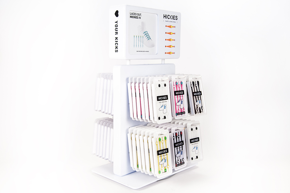
When Medallion Retail designed the Hickies magnetic shoelace counter display, its main purpose was to help introduce the new brand and innovative product to the retail market. The display was initially targeted for small chains, independent athletic and specialty retailers. But as a new brand, Hickies was allotted only a very small footprint on the cash wrap counter. Medallion maximized the footprint by creating a two-sided, rotating display that made browsing and selecting product easy for the customer. The display was situated at the cash wrap counter, advantageously sized, and perfect for impulse purchases during the checkout process.
Lesson #1: Study your environment and make the most of your allotted space.
Know Your Type: The Three Kinds of Retail Displays
Knowing how long your display needs to last is almost as important as knowing your client’s budget and time frame — and all three inform the materials selection process. Shelf life is segmented into the three categories of temporary, semi-permanent and permanent, which dictate the durability of the materials that will be used to produce the display.
Temporary displays
Temporary displays are tasked with lasting two to three months and their low per-unit cost makes them attractive for seasonal or promotional uses. Temporary displays are often intended to be switched out or replaced several times a year, and the low cost allows a retailer or brand to appear fresh and current without a big expense.
Semi-permanent displays
Semi-permanent displays typically last three months to a year, and are constructed from more durable materials. Semi-permanent retail displays provide better a solution for potential customer interaction with the product or display, as the materials will withstand everyday use for a longer period of time.
Permanent displays
Permanent displays represent a greater business investment with a higher ROI than other types of displays and are constructed of very sturdy materials. This long-term option can withstand everyday use for one to three years. Their durability requires a design flexible enough to allow all the product to be switched out.
All three styles offer benefits. The benefits of a temporary or semi-permanent structure often outweigh those of a permanent one as it will take years for the return on a permanent display to pay off.
Lesson #2: Consider shelf life, budget and time frame of your display to determine the best type for your situation.
Keep Stretching: Flexibility and Versatility of Counter Displays
Designing displays that are flexible, versatile, modular and configurable increases the utility of your displays while ensuring the best possible return on investment. The flexibility, meaning the adaptability of your design in display or signage, opens up more opportunity on the sales floor. Modular designs offer the best option for meeting the spatial inequities of different retail environments while also addressing various product mixes and seasonal or promotional opportunities. Replacing parts or components in modular displays also takes less time and energy than replacing complete fixtures in the event of damage or obsolescence.
- Will the display be easy to set up and take down?
- Can you easily update the graphics or media?
- Can you add additional components such as video screens, sound or supplemental graphics?
- Can you scale the display and make it larger or smaller depending on placement in store and available footprint?

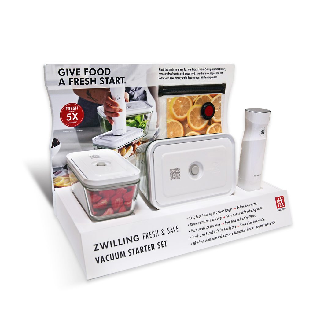
Medallion’s design for Zwilling’s Fresh & Save counter display offers a perfect example of design flexibility. Originally intended for a particular retailer, the display housed a screen playing an instructional video. During the last stages of the design process, the retailer decided against video integration. So Zwilling produced a new plan, this time also involving a second retail partner who did want to include the video element. Flexibility and modularity in Medallion’s designs for the display allowed us to consecutively create two renditions of the same design: one unit with a video screen and one without.
Lesson #3: Flexible, modular design allows you to customize retail displays per retailer and location.
Perfect Aim: Designing for Your Target Customers
Make sure your client provides demographic information that includes a target customer profile and design your display and graphics to speak to that person. Understand who they are, what they value and what motivates them, and design around those behavioral insights. Make an emotional and conceptual connection with them by crafting an attractive and engaging brand story. And don’t allow your customer to leave empty-handed. Be sure your messaging and communication are clear and that the customer walks away with a clear understanding of the top three product or brand insights that will sell your product.
Working with Zwilling to design their countertop display for the debut of their new product, the Fresh & Save Vacuum Storage System, Medallion understood the target audience in this lifestyle product. Those interested in healthy living, advance meal prepping and environmental consciousness would influence the look, feel and messaging of the display piece — connecting with that shopper visually and striking an immediate connection in store. Beauty may be in the eye of the beholder, but if it doesn’t resonate with the beholder, it’s just a beautiful display and one that doesn’t drive sales.
Lesson #4: Know your target to appeal to the right customer
Showcase the Differences: Your Product’s Points of Differentiation
Before beginning the design process, you need to understand the points of differentiation about your client’s product or brand. How is it better than, or at least different from, the competition? Identify points of differentiation about a product by examining how it will be used throughout the entire lifespan with the customer. These points of differentiation should drive messaging and inform design.
Great point-of-purchase displays empower the shopper to quickly zero in on the key points of differentiation of a product relative to its competition by clearly communicating the points of differentiation, and therefore, customer value. Differentiation becomes exceedingly important if your client’s product will sit near to a competitor within a crowded in-store environment.

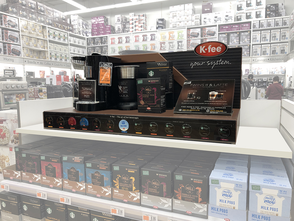
K-fee, the German coffee and espresso system company, sought Medallion’s help in designing a counter display for its first foray into the American market. Located on an endcap in a home goods retailer, close to its competitors Nespresso and Keurig the display needed to convey the main point of differentiation: that the K-fee system accepts both Mr. & Mrs. Mill and Starbucks pods, making it more convenient and flexible than the Nespresso system. The secondary and third points of differentiation focussed on the that the K-fee system’s versatility (making a variety of coffee drinks) and superior technology (featuring a unique pressure mechanism that produces barista-perfect coffee.)
Ultimately, Medallion effectively worked all these points of differentiation into the design of the display. Layered with the sumptuous K-fee product photography and selection of high-end materials used in the display’s design, the end result integrated highly effective messaging with a beautifully elegant look, conveying luxury and convenience.
Lesson #5: Use design to highlight key product differentiators in your display.
Hands-on Experience: Harnessing Customer Interaction
When a shopper can touch, feel and interact with the actual product or display, sales of product increase — and the design process becomes more complicated.
- Will the customer be turning on a video screen?
- Will they be filling out digital forms or browsing through information on a touch screen?
- Will they be scanning through multiple pages of product information?
- Will they be picking up a product to see how it turns on and off, how heavy it is, how easily it comes apart or reassembles and how it works?
- Will they be touching surfaces, experiencing materials and testing a product’s ergonomic properties?
- And what happens when these interactions must meet specific standards?
Does your design take these things in to consideration?
The Americans with Disabilities Act (ADA) requires counter displays that allow for customer interaction to reach no higher than 36” for ease of wheelchair access. They do not mandate height requirements for displays without an interactive component, and both options are allowed simultaneously within the same retail location.

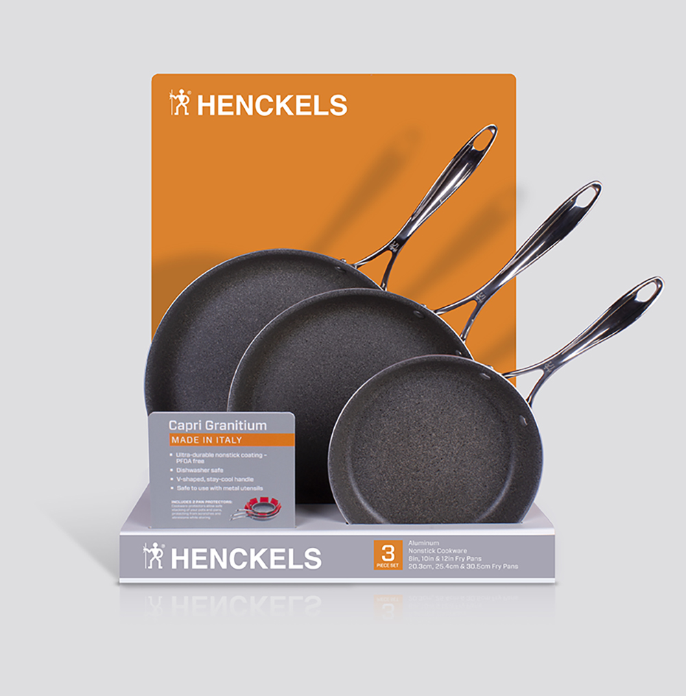
When working on the Henckels Capri Granitium Nonstick Cookware for Costco, Medallion needed to provide a design that permitted both standing customers and customers in wheelchairs to easily pick up and experience the product. The pans, a set of three in graduated sizes, rest in a groove specifically engineered to support each pan so that it stands securely on end while permitting the customer to easily select, consider and return the pan to that same groove.
Zwilling’s Fresh & Save display has several items that need to be accessible for customer interaction. The video-enhanced version needed to be 36” high as the video screen contains a push-to-start feature. The vacuum food storage containers from the Fresh & Save starter kit are glued into the display for security reasons, and the hand-operated Fresh & Save vacuum pump is tethered to the display to allow customers to experience how it feels in-hand.
Lesson #6: Integrate interactive experiences but keep them accessible.
What’s Cooking, Good Looking? Stop them in their Tracks with Aesthetic Design
Last, but certainly not least, we need to mention aesthetics. In this age of Instagram, we know for certain that beautiful images stop people from scrolling through a feed or from making an uninterrupted beeline to a cash register at the end of a trip while shopping in store. Gorgeous images are arresting and lasting and create an instant emotional connection with customers. Attractive materials and surfaces entice customers to reach out and touch. Beauty, when in service of branding and used to appeal to a targeted audience, sells.
Medallion’s K-fee counter display provides an excellent example of beauty in service of branding. Luxurious product photography and high-end materials come together to create a display that exudes sophistication and elegance, setting K-fee apart in the competitive landscape of high-end coffee systems.
Lesson #7: Aesthetic design attracts attention.
Bonus Lesson: Get Help from the Experts!
60 years of retail experience have provided Medallion an unparalleled level of expertise in the design and manufacturing of countertop displays for many retail environments, and for an impressive list of brands and diverse products. A high-impact POP counter display starts with great design, but it’s only one part of a multi-stage journey. Contact us today to find out how Medallion can design, produce and ship your next counter display program.